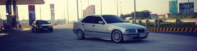
My vote Goes to jdm.lover, not because he's my teammate but because his car actually looks like a muscle, just like piba's and gr1jkee's.
P.S. Sorry if i forgot anybody with a decent Muscle car built.
As before, I've added some comments about each of the entries, under a spoiler.
General comments:
* Thanks to everyone who used one of my mods in this competition. It means a lot to me. I tried not to let that get in the way of my decision making.
* For a few of the newer competitors, remember to use F9 and adjust the FOV.
* To take away some of the emphasis on graphics quality, I focused a lot more on photography theory such as color composition and lighting in this competition. That can really make or break a shot's effectiveness. I, myself, tried to use color theory to post-process my shot, and it influenced my decision-making as well. In general, if your car blends into the pavement, re-think your lighting or color choice.
M3Fx: Solid car overall; nice use of an older mod. Wheels don't quite fit (blue four-bolt wheels on a red car with five-bolt hubs). Background is good, not too distracting; camera angle is well-thought-out. Reflections don't quite match, since the windows are super glossy and the car is flat.
Danilka: Nice car, with a great color. Wheels are hard to see, and wheel choice doesn't seem to match the car. Good wheel fitment, though. Excellent background - what map is that? Would look a little better without the driver in the shot.
E-Bullet: Shot is too dark overall; wheels are too "stanced" out to the corners, especially the front wheels. "No Rice" logo and weird character thingy on the left side don't add much to the shot, especially the character, which is hard to see.
Pette.mk3: Excellent background, and nice car build overall. Wheels are a bit small, though I'll take the blame for that, since those are probably 18s or 19s and it's my mod. Shot is a little too dark - lighting is mostly cool, but hides too much of the car. I've seen the other pics of this car in Show Off Your Rides, and one of the other pics might have been a better entry.
Mad_Drifter: Nice clean shot, with a good angle and clear colors. Wheel fitment is spot-on. Car itself is classic and tastefully built. Nice work.
TurtleBack: Shot is a little too dark. Nice use of color, though the intercooler doesn't really work. Lighting needs improvement. Nice car, and interesting camera angle.
RaggerKnugen13: Photo itself needs a lot of work - don't take your shots in the garage if possible, and if you have to take a shot in the garage, crop out the menu. Angle needs work as well. Car itself is decent, though the color is a little too bright and washes out most of the detail.
Dennypinto: Nice car build, and interesting choice of color. Background is well-chosen, but the lighting and camera angle need work. Try making sure that the shadow won't cover part of the car. Also, if you get pixelated edges on the shadows, turn them off entirely.
Slogun1993/Carbon1993: Nice clean shot of a well-built car. Vignette effect is a little frivolous and hurts the lighting, but otherwise, this is a solid shot.
Tubaman: Sweet car - glad to see people using my mods. Framing is good, keeping the car in focus without being zoomed in too sharply. The background is also good - I use Akina a lot - and you have kept the car against the black tires nicely, keeping the color contrast sharp. A solid shot all around.
phyberoptix: Blue/pink contrast isn't really working, though the pink looks nice against the shipping containers. FOV is way too sharp. Car has visible damage on the grille. Interesting concept, but needs work.
Initial Beebs: Nice car build and nice choice of location. However, switching to black and white destroys a lot of the detail. Lighting is weird - the car is highlighted in the opposite direction from the sun. Framing and angle are good, though there is room for improvement.
g2by: Nice car, and interesting color scheme. Splashes of green work well against the mostly brown background. However, would be good to put the car against a lighter background, to make it more visible. Roof scoop is a little bit out of place; the car screams "low-rider", and that interrupts the smooth roof. Framing is good, though angle could use work.
robijam: Car itself is good, though plain; wheels could actually be tucked a little further under the car. Not a fan of the wheel choice. Framing is too close to the car, and the shot is too zoomed in.
Apan10: Car is OK, especially with the black/red color scheme, but the wheels don't match - try some smaller-diameter wheels on wider tires. Lighting is much too dark. Camera angle needs work, though framing is OK.
FJ: Car is OK, though might have looked better with the decals removed. Wheel fitment is good, and period-correct. The camera angle isn't particularly interesting. Car is just a little too bright, and looks washed out. Color scheme of the whole pic needs improvement.
piba: Decent enough car, with period-correct details; good framing and lighting, and great post-processing. However, there isn't a good center point of visual interest for the picture. A fairly good entry.
jdm.lover: Excellent car build, with good period-correct details. Focus / blurring effect works well here, though I'm not sure whether this background is actual SLRR. Camera angle and framing are great.
Gr1jkee: Excellent car - again very period-correct. Excellent choice of backgrounds. Framing and camera angle are good, but a little cramped. Grainy filter on the photo doesn't add anything, and looks thrown on - some color correction would have been a better choice if you wanted to make this look like a vintage photo.
PedroMarques: Interesting car build - unique enough from the rest of the entries. Lighting needs a lot of work; the shadows obscure a lot of detail. Pic should have been taken without the driver. Background could work, but is too cramped. The car blends into the background too much, so colors need some re-thinking.
g4tnt: Excellent color scheme on the car and for the whole pic. Camera angle and framing are spot-on. Good, unique choice of cars to use as a base; however, the blower scoop doesn't match the rest of the car, and the wheels are even more out of place. This shot shows a lot of promise.
kidtonge: Nice car build - wheels and wheel fitment match the base car nicely. This is also a good spot to take pictures. The camera angle was a poor choice - it hides both the front and the back of the car, and isn't interesting. Framing also needs work: there is more space on the right side than on the left. Also, crop out the top bar if you are taking pics in Valo.
Earlnutarak: Nice car. Wheels fit the build nicely. The rolled-down window is also a cool touch. Car is a little too shiny, and the hood doesn't match - another reflection set would have worked better here. Camera angle and framing are excellent. Photo editing adds some nice touches to this car - the lens scratches do an excellent job of making this look like an old photo. To improve the effect, some color correction (sepia tone) would have done nicely, and the Unknown Crew logo should have been a watermark instead of a bright red logo.
Sekailain: Car positioning is good. Would have looked nicer if the car lot were cleared out. Needs less camber on the rear wheels.
iliutza: Mostly a nice shot; the stripes look good on the car. Car is too small in the picture, and it is too dark to see any detail. Great choice of locations. I wish I could have gotten the sky in Ambush Canyon to look that good.
WhiteVanWookie: Nice car mostly, but it's hard to see much of it with the headlight glare. FOV is way too sharp. Camera angle is otherwise unique and works well. I wish we could see more of the car than is visible in this shot.
matheus111114: Nice car build, even if it's a little over-the-top. FOV is too sharp, and framing needs a lot of work. Camera angle would be good with FOV and framing fixed.
ILLKING: Excellent car and engine build. However, the shot is way too dark, and it's hard to see much of the car. Vignette effect is unnecessary and makes an already dark shot even darker. Framing and angle are good; work on the lighting.
Darius1695: Nice build. I love the carbon effect on the hood and front bumper, and the wheel fitment definitely works. Details on the whole car are excellent. Framing is good. The color scheme of the whole shot needs work - everything is grey, and there is not enough visual interest.
GolfPlaya: That shade of blue is just a little too saturated, but the car is mostly good overall. Wheel camber is too strong on the rear wheels. Background is good. Framing is a little too tight. Color scheme is a little bit off - everything looks a little too purple.
Back_in_Black: Excellent action shot. Car build is good and period-correct. Framing is SUPERB. Tire smoke could use a little work - try adjusting the options for the tire smoke particles a bit. Color choice on the whole shot is weird. As a suggestion, try re-coloring the yellow stripes to the orange color you have for the rest of the car, and then making the rest of the car yellow (so it goes yellow-orange-black instead of orange-yellow-black). I'd be interested to see how the car looks with that change.
ebone: Nice, unique car with a solid color scheme. Background is excellent (what map is that?). The colors of the background work perfectly with the car. Vignette effect should be removed.
jimbowe__: Interesting car build - pity we can't see more of it. Shot is WAY too dark. Background looks like it might have been interesting in brighter lighting. Camera angle and framing make it even harder to see much.
nemezis: This is a surprisingly good shot. Wheels don't fit the car, but the tires do. The car is otherwise quite nice. Lighting is great - the purple-blue of the sky matches the yellow of the car, and the headlights give some visual interest without being too bright. Camera angle is good. Framing needs just a bit of work; it would have been better if you had put a little more of the sky to the right of the picture.
adha77: Car is interesting, but the wheel colors don't look right, and the rear wheels have too much camber. Camera position needs work - let's see more of the front of the car!
Rokus: Great shot, as always. Wheels are period-correct, though not very visually interesting. Purple car works great against the greenish natural background. Framing could use just a little bit of work - either move the car further to the right, or further to the center.
stance666: Excellent car build, with good choice of wheels and fitment. I love the larger rear tires. Red car works nicely against the yellow stripes and green-grey pavement. Framing and camera angle are great. Blur effect from the farther-out part of the shot is spot-on. The only real issue is that the car could have been closer to the camera. This is an incredible pic.
Daniel: Excellent graphics quality, lighting, and shot angle, as always. Car is a classic, and although the wheels might not be period-correct, it fits the theme well.
Jesus Christ: Excellent low-rider - this is one car where the "I <3 LOWCARS" plate works well. Interesting angle and framing.
Camarofan: Car build is nice, though the wheel fitment needs work. Lighting and angle make it hard to see much of the car. Background is alright.
Shadowkind: Nice car build, though a little generic. Lighting is good, and works well with the background. Color balance also works nicely - nice purple/yellow contrast. Picture is blurry, and the angle needs work.
Pera: Nice unique car choice, and good framing and angle. Could be a little more zoomed in. Wheels don't really match the car. Also, your reflection pack doesn't really work that well.
Balint: Nice car, and good solid color scheme. Reflections look nice. Wheel fitment is good. A very solid shot overall. It might be a little dark, but that's not really a problem.
HaxoReSc: Nice car build - a modern twist on the Foxbody (though, a GT based on a notchback?), with good wheel fitment. Angle and framing are good. The picture might be a little dark, and the reflections are a little too shiny, but otherwise a solid pic.
Franco: Nice unique angle, and one of the best black-painted cars in the competition - black is a hard color to photograph right, especially in a shot at night like yours. Lighting is good. Overall a very solid shot of a mean-looking car.
kkilla305: Angle is good, as is the color balance. However, I'm not really a fan of the car. The spoiler doesn't seem to flow that well with the body (it looks like a standard SL Tuners wing), and the wheels and intake stacks totally do not fit.
dicio_cross: Nice solid shot composition, though the angle could use a bit of work. Colors are balanced well enough - the car stands out against the background just enough. The shot could, however, use more focus on the car. Car build is good - the wheel fitment works well here, and it looks like an 80s racer.
Wh0?: Background is too flashy, and has too many things that stand out more than the car, which is way too dark. Car build itself is good, but the lighting and background choice needs a lot of work. Angle and framing are good.
dary762: Excellent shot - I love the rain effect and the color balance, for the most part. Post-proccessing makes this shot amazing. The only thing that had me wondering here, is that the chrome is orange and the rest of the shot is blue, which doesn't make sense in terms of lighting. Car build is also good and memorable, with a lot of period-correct details. I love the window net and the wheels.
zakymzf: Interesting car build, but it's difficult to see much of it from that angle. Background is also uninspired - even if you have to use the test track, take it somewhere other than the starting grid of the oval. Color balance is washed out; I would suggest turning off ESL shaders in the options.
markgt: Nice car build. Framing is good, and the angle works fairly well. The only questionable thing is that the car is mostly blue, which does not work for lighting purposes since it's against an orange setting sun.
i go extreme: Probably one of the more unique Foxbodies in this contest. The details really make this build work - the turbos with the angry fire-breathing exhaust, and the staggered rear wheel fitment. The angle is visually interesting and shows a lot of the car, but the shot could be framed against the car a little more closely. Background choice is good.
Wolf75: Paint job is good, but your shiny reflections obscure a lot of it. Camera angle also makes it hard to see much of the car.
T-Rex: Fairly solid Shelby, though it's odd that you used Ram SRT-10 wheels on it. I love the red sky against the red car - the lighting really works here. Tilted angle doesn't really add anything - I would have liked to see this shot with the camera tilted less. Background works really well here, and lets the car stand out.
Pro7: Nice car, but the shot is WAY too dark. Everything else about the pic seems to work.
blast: I like the background here, and the car is nice and unique, with a set of wheels that works but aren't anything special. Framing is good. The shot is way too dark, and the car blends into the road too well. This would have been an A+ shot if the car was yellow or another bright color.
Morpheus Hell: I really liked this one. Interesting background, solid concept - it does a lot with what looks like an old mod. The post-processing to make this look like an old photo really works. Lighting is excellent all-around.
Mr Flumb: Interesting and inspired angle, and nice choice of cars. However, this shot is too dark and too grey to make out a lot of the details. Also, SLRR's rendering isn't really good enough to really make this shot work with full reflections. A great concept, but needs work in the execution.
Badoyz: Nice car, though the rims don't really work in my opinion. Background is good, though the angle could use a bit of work. The shot is a little bit too dark all around.
Ryancooper: A good build of a classic car. Nice angle. Framing is good, though you could have moved the frame to get just a little more above the car and just a little less of the road. Reflections are a little too bright for this shot.
JoeAlex: Lighting obscures a lot of the side of the car here, as well as the wheels. Framing cuts a little too close to the car on all sides. Color choice works here.
KevinCH: Nice, solid, period-correct Boss build. I love the lighting and background here. Framing and angle are good. Some of the darker parts of the shot are lacking detail, but that is acceptable. A very solid shot all around.
Moonkeey: Interesting car build, though I'm not sure what to say about the wheel fitment (steelies on a Cobra?). Background choice is good. However, the shot is REALLY blurry, so that makes it hard to say much more.
Dariuss: Decent car build, though nothing special. Framing, angle, FOV, and lighting are good. A well-rounded picture, but nothing particularly special.
Roleplay set roughly in a fictionalized version of Phoenix, Arizona. The time varies, with a lot of flashbacks / stories told through old photos as well as flash forwards to later times, but is intended to be one continuous story. My character is about 5 years older than myself, and considerably richer. lol. I have a couple of other made-up characters for the RP too.
Current cars:
- Nissan Skyline GT-R V-Spec (BCNR33 1996 S2)
- Toyota Supra (JZA80 1993) - auto N/A; work in progress
Will the R33 ever be released? When? : The R33 is a long running work in progress that will be released when it's done, and not a moment sooner. I'm definitely being a perfectionist about this, but I want this to be the mod the community deserves and expects, not merely the latest in a set of stop-gap mods.
Will you be making a Mustang 2015 / S550? : Not after the large bunch of other stuff I'm planning to make is all done.
Is that your mod in those screenshots? : Is it the Skyline R33, the Audi A5, the Crossfire, the Supra JZA80 (with Bigg Boss93) or one of the ones I've released (like the Mustangs)? If so, yes. If not, probably not; search the GOM and VStanced downloads sections for it.
Mustang mod updates? : A new SN95 1995 Mustang mod is planned (the original wasn't mine); a Foxbody remake with LOD0 meshes is in the works, and will include more parts than the original version; and I am preparing updates to the SN95 2000, many of which are finished but not there yet.
As before, I've added some comments about each of the entries, under a spoiler.
General comments:
* Thanks to everyone who used one of my mods in this competition. It means a lot to me. I tried not to let that get in the way of my decision making.
* For a few of the newer competitors, remember to use F9 and adjust the FOV.
* To take away some of the emphasis on graphics quality, I focused a lot more on photography theory such as color composition and lighting in this competition. That can really make or break a shot's effectiveness. I, myself, tried to use color theory to post-process my shot, and it influenced my decision-making as well. In general, if your car blends into the pavement, re-think your lighting or color choice.
M3Fx: Solid car overall; nice use of an older mod. Wheels don't quite fit (blue four-bolt wheels on a red car with five-bolt hubs). Background is good, not too distracting; camera angle is well-thought-out. Reflections don't quite match, since the windows are super glossy and the car is flat.
Danilka: Nice car, with a great color. Wheels are hard to see, and wheel choice doesn't seem to match the car. Good wheel fitment, though. Excellent background - what map is that? Would look a little better without the driver in the shot.
E-Bullet: Shot is too dark overall; wheels are too "stanced" out to the corners, especially the front wheels. "No Rice" logo and weird character thingy on the left side don't add much to the shot, especially the character, which is hard to see.
Pette.mk3: Excellent background, and nice car build overall. Wheels are a bit small, though I'll take the blame for that, since those are probably 18s or 19s and it's my mod. Shot is a little too dark - lighting is mostly cool, but hides too much of the car. I've seen the other pics of this car in Show Off Your Rides, and one of the other pics might have been a better entry.
Mad_Drifter: Nice clean shot, with a good angle and clear colors. Wheel fitment is spot-on. Car itself is classic and tastefully built. Nice work.
TurtleBack: Shot is a little too dark. Nice use of color, though the intercooler doesn't really work. Lighting needs improvement. Nice car, and interesting camera angle.
RaggerKnugen13: Photo itself needs a lot of work - don't take your shots in the garage if possible, and if you have to take a shot in the garage, crop out the menu. Angle needs work as well. Car itself is decent, though the color is a little too bright and washes out most of the detail.
Dennypinto: Nice car build, and interesting choice of color. Background is well-chosen, but the lighting and camera angle need work. Try making sure that the shadow won't cover part of the car. Also, if you get pixelated edges on the shadows, turn them off entirely.
Slogun1993/Carbon1993: Nice clean shot of a well-built car. Vignette effect is a little frivolous and hurts the lighting, but otherwise, this is a solid shot.
Tubaman: Sweet car - glad to see people using my mods. Framing is good, keeping the car in focus without being zoomed in too sharply. The background is also good - I use Akina a lot - and you have kept the car against the black tires nicely, keeping the color contrast sharp. A solid shot all around.
phyberoptix: Blue/pink contrast isn't really working, though the pink looks nice against the shipping containers. FOV is way too sharp. Car has visible damage on the grille. Interesting concept, but needs work.
Initial Beebs: Nice car build and nice choice of location. However, switching to black and white destroys a lot of the detail. Lighting is weird - the car is highlighted in the opposite direction from the sun. Framing and angle are good, though there is room for improvement.
g2by: Nice car, and interesting color scheme. Splashes of green work well against the mostly brown background. However, would be good to put the car against a lighter background, to make it more visible. Roof scoop is a little bit out of place; the car screams "low-rider", and that interrupts the smooth roof. Framing is good, though angle could use work.
robijam: Car itself is good, though plain; wheels could actually be tucked a little further under the car. Not a fan of the wheel choice. Framing is too close to the car, and the shot is too zoomed in.
Apan10: Car is OK, especially with the black/red color scheme, but the wheels don't match - try some smaller-diameter wheels on wider tires. Lighting is much too dark. Camera angle needs work, though framing is OK.
FJ: Car is OK, though might have looked better with the decals removed. Wheel fitment is good, and period-correct. The camera angle isn't particularly interesting. Car is just a little too bright, and looks washed out. Color scheme of the whole pic needs improvement.
piba: Decent enough car, with period-correct details; good framing and lighting, and great post-processing. However, there isn't a good center point of visual interest for the picture. A fairly good entry.
jdm.lover: Excellent car build, with good period-correct details. Focus / blurring effect works well here, though I'm not sure whether this background is actual SLRR. Camera angle and framing are great.
Gr1jkee: Excellent car - again very period-correct. Excellent choice of backgrounds. Framing and camera angle are good, but a little cramped. Grainy filter on the photo doesn't add anything, and looks thrown on - some color correction would have been a better choice if you wanted to make this look like a vintage photo.
PedroMarques: Interesting car build - unique enough from the rest of the entries. Lighting needs a lot of work; the shadows obscure a lot of detail. Pic should have been taken without the driver. Background could work, but is too cramped. The car blends into the background too much, so colors need some re-thinking.
g4tnt: Excellent color scheme on the car and for the whole pic. Camera angle and framing are spot-on. Good, unique choice of cars to use as a base; however, the blower scoop doesn't match the rest of the car, and the wheels are even more out of place. This shot shows a lot of promise.
kidtonge: Nice car build - wheels and wheel fitment match the base car nicely. This is also a good spot to take pictures. The camera angle was a poor choice - it hides both the front and the back of the car, and isn't interesting. Framing also needs work: there is more space on the right side than on the left. Also, crop out the top bar if you are taking pics in Valo.
Earlnutarak: Nice car. Wheels fit the build nicely. The rolled-down window is also a cool touch. Car is a little too shiny, and the hood doesn't match - another reflection set would have worked better here. Camera angle and framing are excellent. Photo editing adds some nice touches to this car - the lens scratches do an excellent job of making this look like an old photo. To improve the effect, some color correction (sepia tone) would have done nicely, and the Unknown Crew logo should have been a watermark instead of a bright red logo.
Sekailain: Car positioning is good. Would have looked nicer if the car lot were cleared out. Needs less camber on the rear wheels.
iliutza: Mostly a nice shot; the stripes look good on the car. Car is too small in the picture, and it is too dark to see any detail. Great choice of locations. I wish I could have gotten the sky in Ambush Canyon to look that good.
WhiteVanWookie: Nice car mostly, but it's hard to see much of it with the headlight glare. FOV is way too sharp. Camera angle is otherwise unique and works well. I wish we could see more of the car than is visible in this shot.
matheus111114: Nice car build, even if it's a little over-the-top. FOV is too sharp, and framing needs a lot of work. Camera angle would be good with FOV and framing fixed.
ILLKING: Excellent car and engine build. However, the shot is way too dark, and it's hard to see much of the car. Vignette effect is unnecessary and makes an already dark shot even darker. Framing and angle are good; work on the lighting.
Darius1695: Nice build. I love the carbon effect on the hood and front bumper, and the wheel fitment definitely works. Details on the whole car are excellent. Framing is good. The color scheme of the whole shot needs work - everything is grey, and there is not enough visual interest.
GolfPlaya: That shade of blue is just a little too saturated, but the car is mostly good overall. Wheel camber is too strong on the rear wheels. Background is good. Framing is a little too tight. Color scheme is a little bit off - everything looks a little too purple.
Back_in_Black: Excellent action shot. Car build is good and period-correct. Framing is SUPERB. Tire smoke could use a little work - try adjusting the options for the tire smoke particles a bit. Color choice on the whole shot is weird. As a suggestion, try re-coloring the yellow stripes to the orange color you have for the rest of the car, and then making the rest of the car yellow (so it goes yellow-orange-black instead of orange-yellow-black). I'd be interested to see how the car looks with that change.
ebone: Nice, unique car with a solid color scheme. Background is excellent (what map is that?). The colors of the background work perfectly with the car. Vignette effect should be removed.
jimbowe__: Interesting car build - pity we can't see more of it. Shot is WAY too dark. Background looks like it might have been interesting in brighter lighting. Camera angle and framing make it even harder to see much.
nemezis: This is a surprisingly good shot. Wheels don't fit the car, but the tires do. The car is otherwise quite nice. Lighting is great - the purple-blue of the sky matches the yellow of the car, and the headlights give some visual interest without being too bright. Camera angle is good. Framing needs just a bit of work; it would have been better if you had put a little more of the sky to the right of the picture.
adha77: Car is interesting, but the wheel colors don't look right, and the rear wheels have too much camber. Camera position needs work - let's see more of the front of the car!
Rokus: Great shot, as always. Wheels are period-correct, though not very visually interesting. Purple car works great against the greenish natural background. Framing could use just a little bit of work - either move the car further to the right, or further to the center.
stance666: Excellent car build, with good choice of wheels and fitment. I love the larger rear tires. Red car works nicely against the yellow stripes and green-grey pavement. Framing and camera angle are great. Blur effect from the farther-out part of the shot is spot-on. The only real issue is that the car could have been closer to the camera. This is an incredible pic.
Daniel: Excellent graphics quality, lighting, and shot angle, as always. Car is a classic, and although the wheels might not be period-correct, it fits the theme well.
Jesus Christ: Excellent low-rider - this is one car where the "I <3 LOWCARS" plate works well. Interesting angle and framing.
Camarofan: Car build is nice, though the wheel fitment needs work. Lighting and angle make it hard to see much of the car. Background is alright.
Shadowkind: Nice car build, though a little generic. Lighting is good, and works well with the background. Color balance also works nicely - nice purple/yellow contrast. Picture is blurry, and the angle needs work.
Pera: Nice unique car choice, and good framing and angle. Could be a little more zoomed in. Wheels don't really match the car. Also, your reflection pack doesn't really work that well.
Balint: Nice car, and good solid color scheme. Reflections look nice. Wheel fitment is good. A very solid shot overall. It might be a little dark, but that's not really a problem.
HaxoReSc: Nice car build - a modern twist on the Foxbody (though, a GT based on a notchback?), with good wheel fitment. Angle and framing are good. The picture might be a little dark, and the reflections are a little too shiny, but otherwise a solid pic.
Franco: Nice unique angle, and one of the best black-painted cars in the competition - black is a hard color to photograph right, especially in a shot at night like yours. Lighting is good. Overall a very solid shot of a mean-looking car.
kkilla305: Angle is good, as is the color balance. However, I'm not really a fan of the car. The spoiler doesn't seem to flow that well with the body (it looks like a standard SL Tuners wing), and the wheels and intake stacks totally do not fit.
dicio_cross: Nice solid shot composition, though the angle could use a bit of work. Colors are balanced well enough - the car stands out against the background just enough. The shot could, however, use more focus on the car. Car build is good - the wheel fitment works well here, and it looks like an 80s racer.
Wh0?: Background is too flashy, and has too many things that stand out more than the car, which is way too dark. Car build itself is good, but the lighting and background choice needs a lot of work. Angle and framing are good.
dary762: Excellent shot - I love the rain effect and the color balance, for the most part. Post-proccessing makes this shot amazing. The only thing that had me wondering here, is that the chrome is orange and the rest of the shot is blue, which doesn't make sense in terms of lighting. Car build is also good and memorable, with a lot of period-correct details. I love the window net and the wheels.
zakymzf: Interesting car build, but it's difficult to see much of it from that angle. Background is also uninspired - even if you have to use the test track, take it somewhere other than the starting grid of the oval. Color balance is washed out; I would suggest turning off ESL shaders in the options.
markgt: Nice car build. Framing is good, and the angle works fairly well. The only questionable thing is that the car is mostly blue, which does not work for lighting purposes since it's against an orange setting sun.
i go extreme: Probably one of the more unique Foxbodies in this contest. The details really make this build work - the turbos with the angry fire-breathing exhaust, and the staggered rear wheel fitment. The angle is visually interesting and shows a lot of the car, but the shot could be framed against the car a little more closely. Background choice is good.
Wolf75: Paint job is good, but your shiny reflections obscure a lot of it. Camera angle also makes it hard to see much of the car.
T-Rex: Fairly solid Shelby, though it's odd that you used Ram SRT-10 wheels on it. I love the red sky against the red car - the lighting really works here. Tilted angle doesn't really add anything - I would have liked to see this shot with the camera tilted less. Background works really well here, and lets the car stand out.
Pro7: Nice car, but the shot is WAY too dark. Everything else about the pic seems to work.
blast: I like the background here, and the car is nice and unique, with a set of wheels that works but aren't anything special. Framing is good. The shot is way too dark, and the car blends into the road too well. This would have been an A+ shot if the car was yellow or another bright color.
Morpheus Hell: I really liked this one. Interesting background, solid concept - it does a lot with what looks like an old mod. The post-processing to make this look like an old photo really works. Lighting is excellent all-around.
Mr Flumb: Interesting and inspired angle, and nice choice of cars. However, this shot is too dark and too grey to make out a lot of the details. Also, SLRR's rendering isn't really good enough to really make this shot work with full reflections. A great concept, but needs work in the execution.
Badoyz: Nice car, though the rims don't really work in my opinion. Background is good, though the angle could use a bit of work. The shot is a little bit too dark all around.
Ryancooper: A good build of a classic car. Nice angle. Framing is good, though you could have moved the frame to get just a little more above the car and just a little less of the road. Reflections are a little too bright for this shot.
JoeAlex: Lighting obscures a lot of the side of the car here, as well as the wheels. Framing cuts a little too close to the car on all sides. Color choice works here.
KevinCH: Nice, solid, period-correct Boss build. I love the lighting and background here. Framing and angle are good. Some of the darker parts of the shot are lacking detail, but that is acceptable. A very solid shot all around.
Moonkeey: Interesting car build, though I'm not sure what to say about the wheel fitment (steelies on a Cobra?). Background choice is good. However, the shot is REALLY blurry, so that makes it hard to say much more.
Dariuss: Decent car build, though nothing special. Framing, angle, FOV, and lighting are good. A well-rounded picture, but nothing particularly special.
this is just one of the most hilarious post i ever read, 80% of comments start with "nice" and none of them is perfect.... lolwtfbbqbro
PS: really, where do you find the time to write a random, not totally positive and with lots of WAT comment about everyone's pic? xD
With so much drama in the V-S-T, it's kinda hard being Bigg B-O-double-S-ninetythree


